Two sides of a story
Banknote design is far more than just design, says Marc Mittelstaedt, the head designer for G+D. It involves grappling with a combination of different demands, as well as a network of diverse stakeholders. It necessitates creating a story that reinforces security – both in the technology employed and in the user’s perception.
Superficially, what you see on a note is what you get: an image, a number, a value cast in color, form, and pattern. But isn’t it always tied to the underlying certainty: you can accept this, you can trust this, you can pay with it?
We believe it is, and to ensure we deliver this underlying certainty, we have to be combiners, connectors, and creators. You need more than just artwork to turn a design into a banknote. A note may look “flat” at first (with a touch of three-dimensionality if we add the depth of an optically variable security feature), but our work is anything but two-dimensional. In terms of design, it is closer to product design than graphic design; it is more like designing an automobile fender than a glossy magazine.
Why is this?
In classic graphic design, the process of transforming what you have envisioned into print is straightforward. In banknote design, however, you have to deal with a plethora of different concerns, from paper production to imbedded security features to machine readability. It is this process of gathering all the threads together that makes our work – and hence, the product – so fascinating.
The true essence of our design? Offering people a means of identification
Once you have sorted paper production, security features, and product design, and have delivered on the customer’s wishes, there is hardly any room for art and creativity, right?
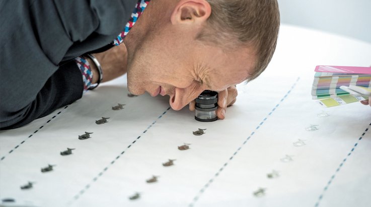
Art and creativity matter when we are combining all of the various details. When we get that request to "please come up with a design concept" we start by working on paper. Then we have to start asking the big questions: What’s the base, the substrate? Polymer, paper, or a hybrid product? Large or small watermarks? How and where do we imbed threads, foil, or watermarks? All of these issues have to be taken into consideration at a very early stage of the conceptual process. As designers, we deal with various stakeholders, all with their own ideas and concepts. A banknote is the result of that developmental process.
Banknotes are always a compromise then? No perfect solution here?
Naturally, compromises have to be made, and usually on both sides. However, we always arrive at positive solutions because we deftly blend our expertise with the experience and expectations that our customers bring to the table. We know that there is no such thing as the perfect banknote, at least in the sense that any one interest group might consider perfect. But there is one customer, one people, one country for whom our product has to work. Going to the "people" and offering them a means of identification is the true essence of our design.
Two sides that “talk” to each other
Amid all of the compromises and technology, where is the art and the ambition to make something unique?
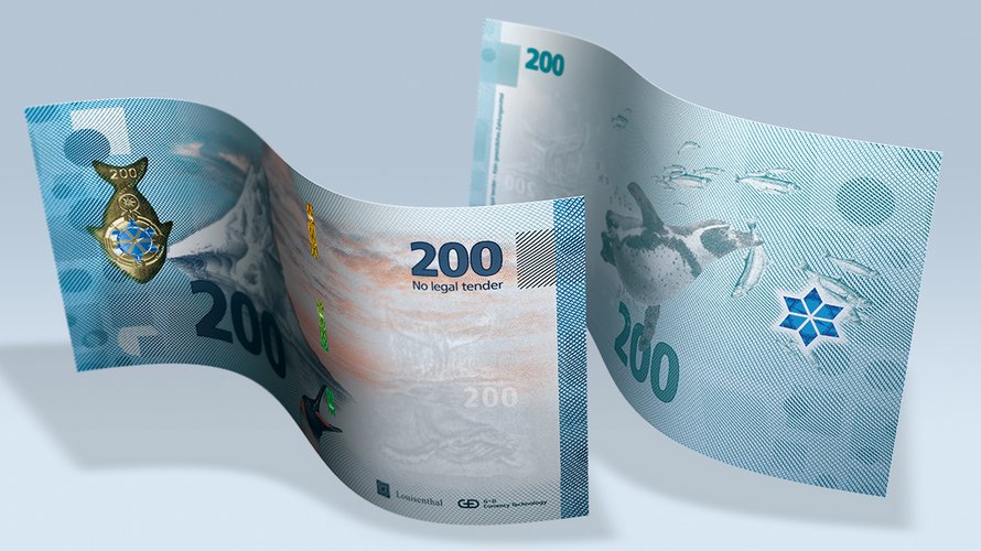
We tell unique stories! The trick here is to combine the front and back of the note to create a narrative arc that spans various elements. A story that flows from front to back, allowing both sides to “talk” to each other. We then integrate the security elements into the design – for example, a foil stripe picks up on a design element, so that the thread weaves the image into a story. This means that the mission and the vision merge; the note tells the story and it is that storytelling that reinforces security, through both the technology employed and the user’s perception. When we connect a variety of formal security features to each other through design and have a strong story to tell we create a sense of security.
It sounds as if there is more to designing banknotes than there is to designing an automobile fender?
Of course: through the story on the note we create a connection between money and people. We usually employ some kind of familiar national myth or motif the population can immediately recognize and relate to – something that is durable and works well, something that as many people as possible can identify with. Banknotes are a nation’s calling card.
Despite all of the national symbolism, the banknote as such is certainly under “digital attack.” Doesn’t that mean it has to compete in a completely different way these days?
Maybe we ought to beat the drum more; make more of a noise about this issue. Of course, we are in competition with alternative forms of payment, both digital and mobile. Cash is a public good and it is easy to handle for everybody – you don’t need a bank account or smartphone. Cash is universal and has an important role in financial inclusion. I occasionally miss this side about cash in the debate, the real meaning of free, unfettered payment.
Get in touch
If you have any questions about our end-to-end business solutions or about our SecurityTech company, seek expert advice, or want to give us your feedback, our team is here to support you, anytime.


